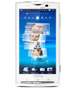
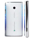
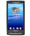
Sony has built up a lot of excitement with the next imminent release from the Ericsson stable: the Xperia X10. The Internet has long been abuzz with news of the X3, but evidently the product warrants more than a single digit increase in quality, so it has been bumped up into the big league with an X10 tag.
The company hopes to make this a flagship product, for a number of reasons: it will be the first in a long range of phones of a similar cadre, it is Sony's first foray into the smartphone major league and mostly it will be a sort of comeback from previously disappointing releases.
Look, Design, Feel (/10)

The phone is surprisingly lightweight, with rounded edges for a softer finish. The front has only three hardware buttons, a home button flanked by selection and cancel keys. These keys are context-sensitive and change function accordingly.
The top of the phone has the power key, thankfully of a useful size. There is also a microUSB port, something that Sony has very recently decided to add to their phones. Lastly there is the 3.5 mm audio jack for headphones.
The back is smooth, with a small camera lens embedded and sitting flush against the back panel. There is a minuscule LED flash just under.
The Xperia only loses points in the design department because it is a large handset. Of course this particular factor is entirely due to the massive 4 inch screen, but the size nevertheless remains slightly unwieldy.
Features (/10)

There is no doubt that the Sony Ericsson has all the standard features that come packaged with a smartphone; especially one powered by Android. However there are three features that stand out the most and one glaring omission, so we will focus on those.
Timescape: With the varied means of communication that exist jointly in the Internet and mobile space today, communication between two individuals can take any number of forms: whether Twitter, Facebook or email, not to mention text messaging and calls. Timescape aggregates all the communication content and displays it as one timeline, allowing a user a comprehensive bird’s eye view of their communication history. The application can be filtered in multiple ways: whether by specific contact, or communication method. The display is shown as a set of cascading tiles, where each tile represents one communication. Clicking on one tile will expand the communication details, and clicking on the expanded view will take the user to the application in question.
Mediascape: Similar conceptually to Timescape, Mediascape gathers all the user’s multimedia content under one broad umbrella. Of course there is the option to view each kind, like music, videos or photographs, in their separate individual home screens. The home screens are split into two panes, one for local phone content and the other for online user content.
Perhaps the most exciting feature of the Xperia X10 is Sony’s assurance that the phone camera experience will be indistinguishable from that of a Cybershot. While this is a tall order, some of the features are there. For example, there is smile recognition. However the most innovative feature is face recognition. The phone now has the capability to recognize faces in pictures, thereby creating the possibility of automatic phototagging. Additionally, if the user taps on the face of one their phototagged buddies, the phone will bring up the contact card for that person. Pretty neat feature all around, it seems to be a micro application of image recognition technology.
The glaring omission we mentioned earlier is the utter absence of multitouch technology. There is unfortunately no excuse, since Android supports the technology just fine, plus the screen is big enough.
Connectivity (/10)
There is no question about the 3G aspect of the phone; it is superfast. Webpages load swiftly and seamlessly without any perceptible lag whatsoever. There is of course excellent Google Maps integration, hardly surprising considering the operating system is Android.
Performance (/10)
The performance of the phone is dismal at the moment. The applications load very slowly, and the charm of being able to scroll through with a fingertip is entirely lost when the scrolling action drags on for minutes. Since the phone is still not released and the demonstrations were performed on older testing models, there is definite hope that the problem will be resolved by the release. It is inexplicable as to why Sony would use an old handset for demonstrations.
The battery consumption of the device seems to be astronomical, as the estimates for battery life are pitifully low. There is little point in spending on a mobile phone that requires constant charging.
Value for Money (/10)
The Sony Ericsson Xperia X10 is reportedly going to debut at a frightfully expensive price. Hopefully, this is going to change soon, otherwise Sony will be saddened to see their flagship device slotted into only the luxe market. It has functions which a smartphone user will appreciate more, and lacks the gilded lily appearance that seems to attract the luxe crowd. So the pricing strategy is doomed to failure.
Our recommendation is to wait it out, and see if a carrier picks up the phone with a better price range in mind.
Pros
+ Beautiful device, with the new Android skin Rachel
+ 4” touchscreen with true 16:9 aspect ratio
+ 8.1 megapixel camera with LED flash
+ 1 GHz snapdragon chip
+ Special applications: Timescape, Mediascape and face recognition technology
+ Comes packaged with an 8 GB microSD memory card
Cons
- No multitouch capabilities
- Battery performance exceedingly poor
 लोडिंग...


